You pull out your phone to find a restaurant, look up a price, read a review, or research a vendor. You do it dozens of times a day and so does every single one of your customers. If your website stumbles on mobile, they don’t pause. They don’t wait. They leave and they almost certainly don’t come back.
That’s not a hypothetical. It’s happening right now, on millions of websites still built for a desktop world that no longer exists.
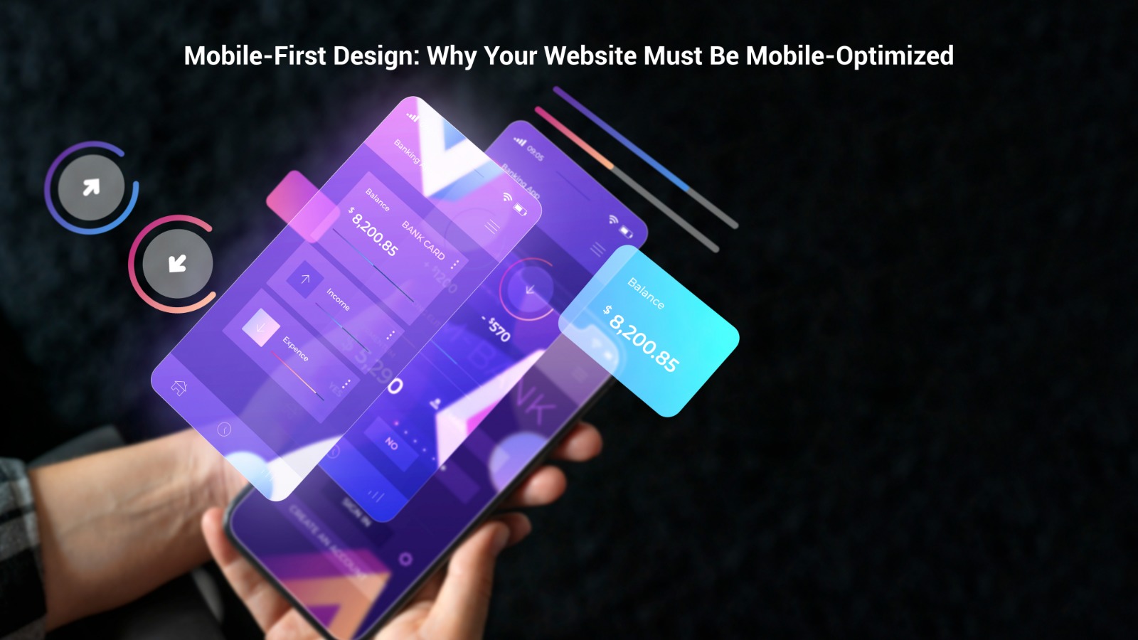
Mobile-first design isn’t a trend. It isn’t optional. It is the baseline expectation of every visitor landing on your site today. At Quickupp Softech, we’ve seen this pattern repeat across industries: businesses investing in great products and services, then losing customers at the very first digital touchpoint because their mobile experience is broken.
In this guide, we break it all down plainly, practically, and without jargon. What mobile-first really means, why it matters more than ever in 2026, what happens when you get it wrong, and exactly what you need to do to get it right.
📊 Quick Stat- 2026: More than 63% of all global web traffic now comes from mobile devices. If your site isn’t built for mobile, you’re turning away the majority of your visitors before they’ve read a single word.
📋 Table of Contents
- What ‘Mobile-First’ Actually Means
- The Numbers That Should Keep You Up at Night
- The Real Cost of Getting Mobile Wrong
- Mobile-First and SEO: Why Google Cares
- What a Genuinely Great Mobile Experience Looks Like
- Common Mobile Design Mistakes & How to Fix Them
- Mobile-First for Different Types of Business
- Progressive Web Apps: The Step Beyond
- How to Audit Your Mobile Experience Right Now
- Mobile-First Design and Your Brand
- How Quickupp Softech Approaches Mobile-First
- Frequently Asked Questions (FAQ)
1. What ‘Mobile-First’ Actually Means And What It Doesn’t
Let’s clear up the most common misconception first. Mobile-first design is not the same as making a desktop website “responsive.” Responsiveness is adaptation you build big, then shrink it down. Mobile-first is the opposite philosophy entirely.
With a mobile-first approach, you design for the smallest screen, the slowest connection, and the most constrained environment first. Then you scale up. You add richness as the screen gets larger you don’t strip it away.
The difference matters enormously. When you design desktop-first and scale down, you’re almost always compromising: hiding things, squishing layouts, stacking elements never meant to stack. The mobile experience feels like an afterthought because it is one.
When you design mobile-first, you’re forced to make smart decisions from the very beginning: What is the single most important thing a user needs to see or do on this page? That discipline produces better design across every screen size.
This philosophy underpins everything we do at Quickupp Softech whether we’re delivering IT services and solutions, designing UI/UX experiences, or consulting on your digital strategy.
The Three Pillars of Mobile-First Design
- Performance first– fast loading on cellular networks across varying signal quality
- Content clarity– showing only what’s essential; ruthlessly removing clutter
- Touch-native interaction– buttons, menus, and forms built for fingers, not cursors
2. The Numbers That Should Keep You Up at Night
If you still need convincing, let the data do the talking. These are not projections, they reflect what’s actually happening right now.
63%+Of all web traffic worldwide is now mobile
53%Of users abandon sites that take 3+ seconds to load
70%Of online purchases made or researched on mobile
61%Of users won’t return to a site they struggled with on mobile
4×Higher bounce rate on slow mobile sites vs fast ones
2019Year Google switched to mobile-first indexing permanently
And here’s what makes those numbers even more consequential: Google has been using mobile-first indexing as its default since 2019. The version of your website that Google crawls, indexes, and ranks is the mobile version. A poor mobile experience doesn’t just lose you customers it loses you search rankings, which means fewer people find you in the first place.
The funnel tightens at every step: Poor mobile experience → worse Core Web Vitals → lower Google rankings → less traffic → fewer conversions → lost revenue. This is why our digital marketing team always treats mobile optimization as a prerequisite, not an add-on, to any SEO or PPC strategy.
3. The Real Cost of Getting Mobile Wrong
It’s tempting to think a mediocre mobile experience is “good enough” that users will just pinch, zoom, and manage. They won’t. And the research proves it, repeatedly.
Consider what happens when someone lands on a poorly designed mobile site. Text too small to read. Buttons so close together every tap feels like a gamble. Forms with tiny input fields autocorrect turns into a war. Images that load so slowly the user has already left. Navigation menus that collapse into impossible dropdowns. Every one of those friction points costs you not abstractly, but in real leads, real sales, and real revenue, right now.
📌 Real Client Result: A retail client came to us with stagnant online revenue. Their desktop conversion rate was a healthy 3.2%. Mobile? Just 0.6% on a channel driving 68% of their traffic. After a mobile-first redesign through our UI/UX team, mobile conversions climbed to 2.4% within 90 days. Same traffic. Same product. Completely different experience.
The cost of inaction is not neutral. Every month you operate with a broken mobile experience is a month of lost revenue, eroding trust, and ground ceded to competitors who are getting it right.
Our portfolio includes mobile-first projects across e-commerce, healthcare, professional services, and local business each one starting with a mobile audit that revealed exactly how much opportunity was being left on the table.
4. Mobile-First and SEO: Why Google Cares About Your Phone
Search engine optimization and mobile experience are no longer separate conversations. Google made them inseparable the day it switched to mobile-first indexing and doubled down by making Core Web Vitals an official ranking factor.
Core Web Vitals are Google’s way of measuring real-world user experience. Three key metrics directly affect where you rank:
Largest Contentful Paint (LCP)
How long does it take for the main content on your page to become visible? Google wants this under 2.5 seconds. If your hero image or headline takes longer than that on a 4G connection, you’re already starting with a ranking penalty.
Interaction to Next Paint (INP)
When someone taps a button or a link, how quickly does your site respond? Sluggish JavaScript, heavy third-party scripts, or unoptimized code can make a site feel broken even if it looks fine. This is now Google’s primary responsiveness metric.
Cumulative Layout Shift (CLS)
That infuriating experience of reading something on your phone and having the text suddenly jump because an image loaded late that’s CLS. A high CLS score is a negative signal for both users and Google’s algorithm.
Getting these three metrics right on mobile is not optional if you want competitive organic rankings. Our team integrates this across every project from custom software development to website redesigns. Better mobile experience → better Core Web Vitals → higher rankings → more traffic → more revenue.
For a deeper look at how Google’s algorithm is evolving, read our blog: Google Ads in 2026: AI Mode & Conversational Search Strategy.
5. What a Genuinely Great Mobile Experience Looks Like
It’s worth painting a clear picture of what you’re actually aiming for not just technically, but from a human perspective. Because mobile-first design is, at its core, designing for people.
Speed That Feels Instant
The fastest mobile sites feel like they’re already there when you tap a link. They achieve this through aggressive image compression, lazy loading of below-the-fold content, minimal JavaScript, CDNs, and server-side rendering. A well-optimized mobile site delivers core content in under 2 seconds on a standard 4G connection.
Navigation Built for Thumbs
Most people hold their phone in one hand and navigate with their thumb. The corners of the screen are the hardest to reach. Great mobile navigation keeps primary actions in the center or bottom of the screen never requiring multiple taps to reach something important. Menus are simple, clear, and always visible.
Typography That Reads Without Zooming
Body text should be a minimum of 16px. Line spacing should give text room to breathe. Contrast ratios need to be high enough to read in direct sunlight. These aren’t revolutionary ideas but they’re violated constantly on websites designed desktop-first.
Forms That Don’t Make People Give Up
Forms are where mobile UX goes wrong most often too many fields, inputs that don’t trigger the right keyboard type, no autofill support, unclear required fields. A mobile-first form is short, smart, and leverages every available browser feature to minimize friction. If someone abandons your checkout or contact form, the form design is usually why.
Media That Loads Intelligently
A 4000px wide hero image served to a 390px phone screen is one of the most common performance killers on the web. Responsive images use the srcset attribute to serve the right size for each device. WebP format. Lazy loading below the fold. Short, autoplay-muted video instead of heavy animations. These are table stakes in 2026.
Our UI/UX design team applies every one of these principles as standard practice. To see how a mobile-first project is structured from the ground up, take a look at how we work.
6. Common Mobile Design Mistakes (And Exactly How to Fix Them)
Even well-intentioned teams make these mistakes. Recognizing them is the first step to fixing them.
- Hover-only navigation: Hover doesn’t exist on touchscreens. Any interaction requiring hover simply won’t work on mobile. Replace hover-triggered dropdowns with tap-triggered menus or always-visible navigation.
- Tap targets that are too small: Google recommends a minimum tap target of 48×48px with adequate spacing between adjacent elements. When buttons and links are crammed together, users misfire and frustration kills conversions.
- Intrusive popups on landing: Full-screen popups that appear the moment someone lands are penalized by Google and despised by mobile users. If you must use them, trigger on exit intent or after meaningful engagement never immediately on arrival.
- Desktop-size images on mobile: This kills performance and wastes mobile data. Always implement responsive images (
srcset) and serve appropriately sized, compressed assets. - Decorative fonts that fail on small screens: Thin, low-contrast, or overly stylized fonts that look great on a 27-inch monitor become illegible on a 6-inch phone screen. Readability always comes first.
- Only testing in browser dev tools: Emulators are useful starting points, but they don’t replicate real-world mobile experience accurately. Always test on actual iPhones and Android devices across varied network conditions.
7. Mobile-First for Different Types of Business
Great mobile experience looks different depending on your industry. Here’s how the principles apply across the most common business categories we work with.
E-Commerce
Mobile commerce is the primary channel now not a secondary one. This means streamlined product pages, one-tap checkout (Apple Pay, Google Pay), persistent cart functionality, thumb-friendly image galleries, and variant selectors that don’t require pinch-zooming. Checkout flows must be reduced to the absolute minimum steps, with saved payment methods and auto filled shipping information.
Local & Service Businesses
For local businesses- restaurants, salons, clinics, contractors- mobile intent is extraordinarily high. People searching for a plumber or a cafe are almost always on their phones and almost always need something now. Phone number and address must be at the very top. Click-to-call buttons. Embedded maps. Fast-loading menus or service lists. Friction anywhere costs you real business.
Professional Services & B2B
Even in B2B, mobile matters more than most companies assume. Executives and decision-makers research vendors on their phones between meetings. Your mobile site may be the first impression you make on a key buyer. It needs to communicate credibility and competence instantly. Our business consulting team often finds this is where the most impactful quick wins exist for B2B clients.
Startups and Growing Businesses
If you’re building something new, mobile-first is foundational. Investors, partners, and early users will evaluate you on mobile first. We’ve helped numerous startups go from idea to mobile-ready product and we document that journey in our blog: From Startup to Scale-Up: How the Right Tech Partner Accelerates Business Growth.
8. Progressive Web Apps: The Step Beyond Mobile-Optimized
Once your website is truly mobile-optimized, the next frontier is the Progressive Web App (PWA). A PWA behaves like a native app it can be added to a home screen, works offline, sends push notifications, and loads near-instantly from cache all without the friction of an app store download.
For businesses that rely on repeat mobile visitors e-commerce stores, service platforms, content publishers, SaaS tools PWAs dramatically increase engagement, session length, and return visits. The key enabling technologies include service workers (offline functionality and caching), Web App Manifests (how the app appears when installed), and HTTPS (required for service workers and a positive ranking signal for Google).
Building PWAs and advanced web applications is part of our IT services and solutions offering. If you’re wondering whether your business is ready for a PWA, contact us for an honest assessment.
💡 Why PWAs Matter for Business
Companies that have implemented PWAs report meaningful improvements in session duration, pages per visit, and conversion rates often without changing their product or pricing at all. The experience itself does the heavy lifting. If your business relies on repeat mobile visitors, a PWA conversation is worth having.
9. How to Audit Your Mobile Experience Right Now
Before you can improve, you need to understand where you currently stand. Here’s a five-step framework you can use immediately no technical background required.
Step 1. Google PageSpeed Insights
Visit pagespeed.web.dev, enter your URL, and run it specifically for mobile. Google scores you from 0–100 across Performance, Accessibility, Best Practices, and SEO and tells you exactly what’s causing problems. Any mobile score below 70 represents a meaningful opportunity for improvement.
Step 2. Google Search Console (Core Web Vitals Report)
If you have Google Search Console set up (and you should), check the Core Web Vitals report. It shows real-world data on LCP, INP, and CLS from actual users visiting your site far more valuable than lab data because it reflects real devices and real network conditions.
Step 3. The One-Hand Thumb Test
Pick up your phone. Go to your website. Try to do the three most important things a customer would want to do find key information, contact you, or purchase/book. Do it with one hand. Time yourself. Every moment of friction is costing you conversions right now.
Step 4. Competitor Mobile Comparison
Visit your top three competitors on your phone. Honestly compare the experience: speed, readability, ease of navigation, ease of contact. If theirs feels better than yours, that is a business problem. If yours is better, that’s a competitive advantage worth amplifying.
Step 5. Heatmaps and Session Recordings
Tools like Hotjar or Microsoft Clarity offer mobile-specific session recordings. Watching real users navigate your mobile site is often the most revealing audit you can do. You’ll see exactly where they get stuck, what they tap that doesn’t respond, and where they give up.
If you’d like a professional mobile audit conducted by our team, reach out through our contact page. We assess performance, UX, Core Web Vitals, and conversion flow and deliver a prioritized list of improvements specific to your site.
10. Mobile-First Design and Your Brand
Here’s a dimension of mobile-first that often gets overlooked: for the majority of people who encounter your business online, your mobile experience IS your brand.
If more than half of your visitors are on mobile and they almost certainly are then more than half of all first impressions are being formed on a small screen. The quality of that experience signals your quality as a business at a subconscious level. A slow, cluttered, hard-to-use mobile site tells a visitor that you don’t pay attention to detail, that you haven’t invested in your customer experience, that you might not be worth trusting.
A fast, clean, thoughtfully designed mobile experience communicates the exact opposite professionalism, care, and competence before a single word has been read.
Mobile-first design is brand investment as much as it is technical investment. This is why our branding and design services and our development work are always treated as one conversation not two separate projects.
If you’re thinking about a full website overhaul, our blog Website Redesign Checklist 2026: Modern Design Trends That Convert is an excellent companion to this guide it covers every element of a modern redesign, with mobile at the center.
11. How Quickupp Softech Approaches Mobile-First Development
At Quickupp Softech, mobile-first design is a non-negotiable part of every web project we deliver. Not because it’s fashionable because our clients’ success depends on it.
Every website we build starts with a mobile prototype. We define the core content hierarchy, the primary user actions, and the performance budget on mobile before we touch a single desktop layout. From there, we scale up adding richness and complexity as the viewport expands, never compromising mobile to make a desktop version look impressive.
Our development team works to strict performance standards on every project: sub-2-second load times on 4G, Lighthouse mobile scores above 90, full Core Web Vitals compliance, and touch targets that meet WCAG accessibility guidelines. These are our baseline not our aspirational targets.
We also understand that mobile-first design isn’t a one-time project. Device capabilities evolve. User behaviors shift. Google’s algorithms update. We build websites structured for continuous optimization. You can learn more about how we structure every engagement on our How It Works page.
Our services span the full digital spectrum: IT services and custom software, UI/UX and branding, digital marketing, business strategy consulting, and BPO services. View our portfolio to see the range of work. We’re also hiring talented people check out our careers page if you’re interested in joining the team.
🚀 Our Commitment to Every Client
Whether you’re launching your first website or overhauling an underperforming digital presence, we treat your mobile experience as your most important customer touchpoint. We build accordingly on time, on budget, and to standards you can measure.
12. Frequently Asked Questions (FAQ)
These are the questions we hear most often from business owners and marketing managers about mobile-first design.
❓ My website already looks fine on my phone. Does it really need a mobile-first redesign?
“Looking fine” and “performing optimally” are two very different things. A site can be visually presentable on mobile and still load in 6 seconds, score 45 on Google PageSpeed, have tap targets that are too small to use comfortably, and convert at a fraction of its potential. The only way to know for certain is to audit your Core Web Vitals in Google Search Console and run a real-device usability test.
If you’d like us to run that audit for you, get in touch here we’ll give you an honest picture of where you stand.
❓ How much does a mobile-first website design cost?
Cost depends on the scope of the project- the number of pages, level of custom functionality, integration requirements, and whether you’re starting from scratch or optimizing an existing site. A targeted mobile performance optimization of an existing site typically costs significantly less than a full redesign. A new mobile-first build for a small-to-medium business ranges from entry-level packages for simple sites to more substantial investment for e-commerce or custom application features.
The better question is: what is a poorly performing mobile site currently costing you in lost conversions? In most cases, the ROI on mobile-first investment is clear and measurable within the first 90 days. Request a custom quote from our services page.
❓ Does mobile-first design directly affect my Google search rankings?
Directly and significantly, yes. Google switched to mobile-first indexing in 2019, which means it crawls and ranks the mobile version of your website not the desktop version. Beyond that, Core Web Vitals (LCP, INP, CLS) are confirmed ranking factors, and all three are measured primarily on mobile. Poor mobile experience → poor Core Web Vitals scores → lower rankings → less organic traffic.
Our digital marketing team integrates mobile performance into every SEO strategy we build. Mobile optimization and SEO are now inseparable disciplines — treating them as separate is a costly mistake.
❓ How long does it take to make a website mobile-first?
For a targeted mobile performance optimization of an existing site image compression, Core Web Vitals fixes, tap target improvements, navigation adjustments meaningful results can typically be achieved within 2–4 weeks depending on site size and complexity. For a full mobile-first redesign, timelines range from 4–8 weeks for simpler sites to 3–5 months for complex e-commerce or custom application projects.
We walk through our project process in detail on the How It Works page. Every project starts with a discovery session where we define realistic timelines based on your specific requirements.
❓ We’re a B2B company do mobile users really matter for us?
More than most B2B companies realize. Research consistently shows that B2B decision-makers use mobile devices extensively during the research and consideration phase reading industry content, evaluating vendors, comparing solutions. The initial research often happens on a phone, even if the final decision is made at a desktop. If your mobile experience is poor during that research phase, you may never get to the desktop consideration stage at all.
Our business consulting team has helped several B2B companies identify and close this gap. The mobile opportunity in B2B is real, underserved, and often a competitive differentiator for the businesses that act on it first.
Final Thoughts: The Window Is Open But Not Forever
Mobile-first design is not a future requirement. It is a present reality. The businesses winning online right now generating the traffic, the leads, the sales are treating mobile as their primary design constraint, not an afterthought.
The encouraging reality is that many businesses still haven’t gotten this right. There is genuine competitive advantage available to the companies that commit to it now. But digital markets move fast, and the gap between businesses that invest in mobile experience and those that don’t will only widen from here.
If your mobile site is slow, hard to navigate, and leaking conversions that is fixable. The audit steps in this guide will show you exactly where the problems are. And if you want a team that has made mobile-first development the foundation of every project they deliver, Quickupp Softech is here. Let’s build something your customers can actually use wherever they are, on whatever device they’re holding.
Ready to Build a Mobile-First Website That Actually Converts?
At Quickupp Softech, we combine mobile-first design, performance engineering, and conversion strategy into every project we deliver on time, on budget, and to standards you can measure.📞 Free Consultation💼 View Our Services🏆 See Our Work